

For my forthcoming upmarket mystery novel, Ghosts in the Pines (September 2026), I am saving a significant portion of my budget to hire a professional cover designer. This is non-negotiable. If I designed the cover, it would be crap. There are too many subtle signals for genre and modern trends are just beyond me.
My job is to make the best damned product possible. With some Photoshop and Illustrator experience—mostly making silly birthday cards for friends—I’m tackling the interior layout myself. Laying out the interior is a branching set of choices. Every choice supports my primary goal of the best possible reading experience.
FONT PAIRINGS
Have you ever read a book where the prose was solid, the story hit the right beats, but the lizard part of your brain kept saying, There’s something wrong here. It’s probably the layout and, in particular, the body font. In an eight-hour reading experience, some fonts are simply easier to read than others. Beyond basic readability though, font choice sets the tone. It’s the difference between showing up on a first date in Crocs and a Coors Lite T-shirt or an oxford and clean sneakers. For a Pacific Northwest gothic mystery, readability is paramount, but the tone should subtly communicate quality.
My first choice
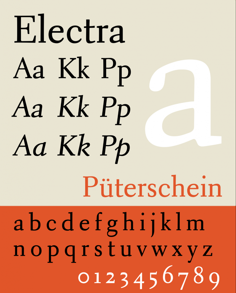
Electra: Precise and moody. Invented in 1935
Novels: Cormac McCarthy’s The Road, Margaret Atwood’s The Handmaid’s Tale.
Price: $240…ouch.
My second choice
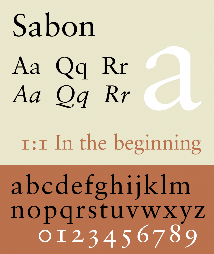
- Sabon LT Pro: Intimate, a subtle roundness to the letters and serif, keeps the reader’s eye moving. Invented in the 1960s
- Novels: J.K. Rowling’s Harry Potter Series, Toni Morrison’s Beloved, Dan Brown’s The Da Vinci Code
- Price: Free with an Adobe license
I went with the Adobe version of Sabon. It saved me $240, but more importantly, it’s the exact same digitization used by major houses. It’s not a budget compromise; it’s using the same tools as the pros without the overhead. And if it’s good enough for Dan Brown…
This left me with a readable and stylish body text. Next choice: pick a heading font that will pair with the body. After some reading, Googling, and asking around, I settled on three finalists. Although perfectly serviceable, Futura is great for the way snow settles over a body, but it was just too clean, too 1940’s noir for my tastes. (I have three polished mystery novels and need the same font for them all to visually string them all together.)
Just from the name itself, I wanted to love Orpheus Pro, which is literally a journey into the underworld—a perfect metaphor for most mystery novels. But it just looks too mystical for such a grounded story.
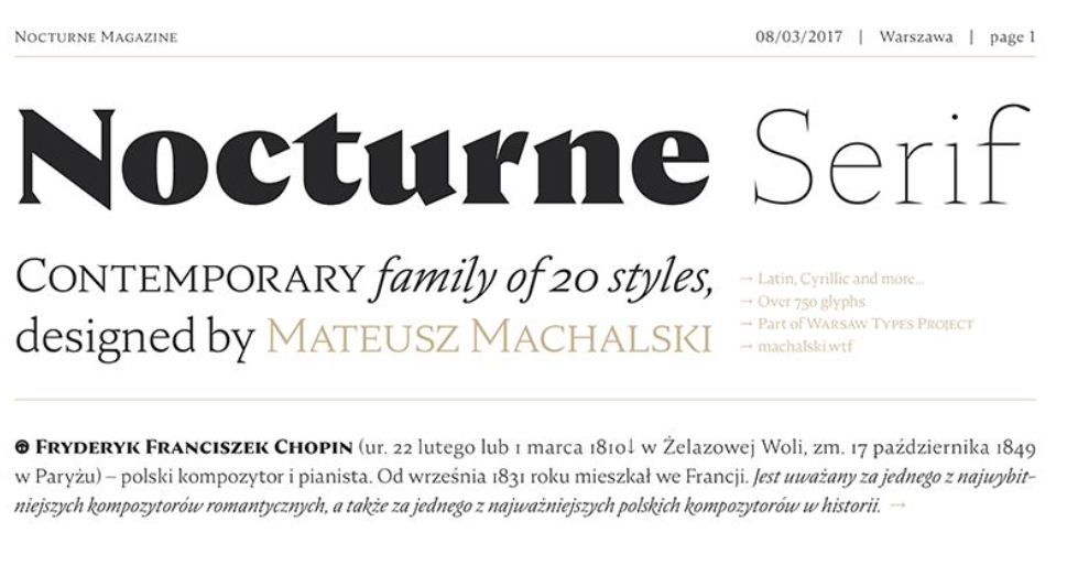
After a lot of trial and error, I was most happy with Nocturne Serif for the headers because it was inspired by the lettering on stone tablets commemorating WWII victims in Warsaw. It literally comes from stonework, headstones, and ghosts. On the practical side, it was free with Adobe and has 20 styles.
Here’s what the text looks like before.
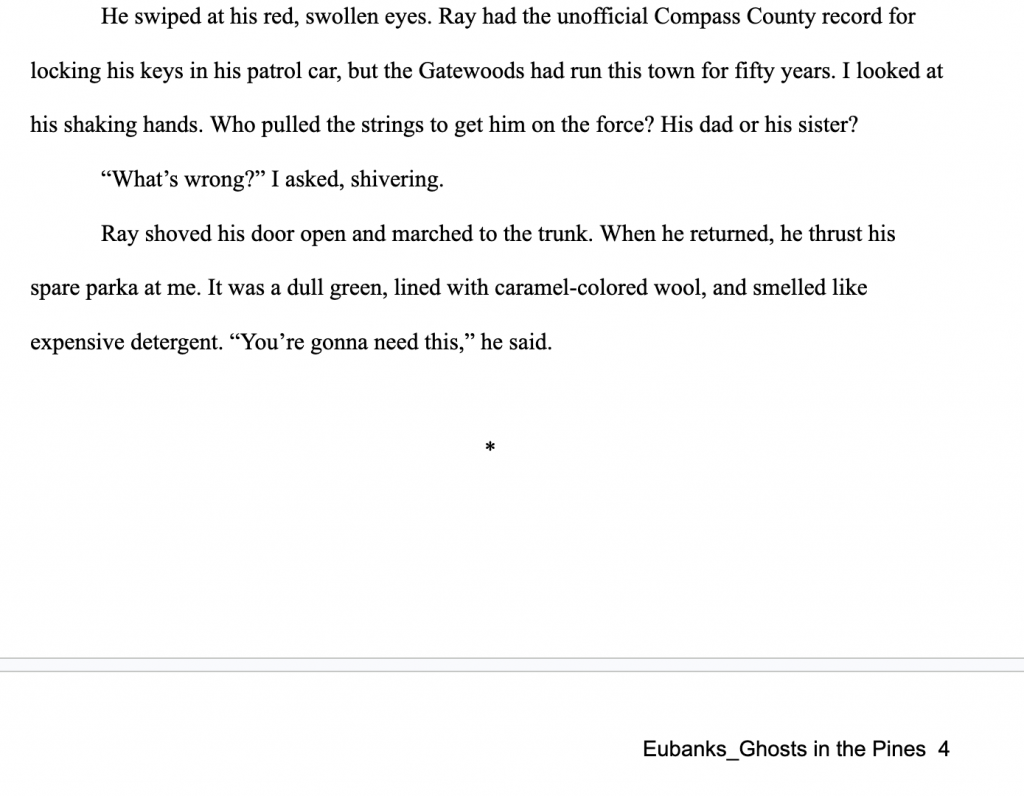
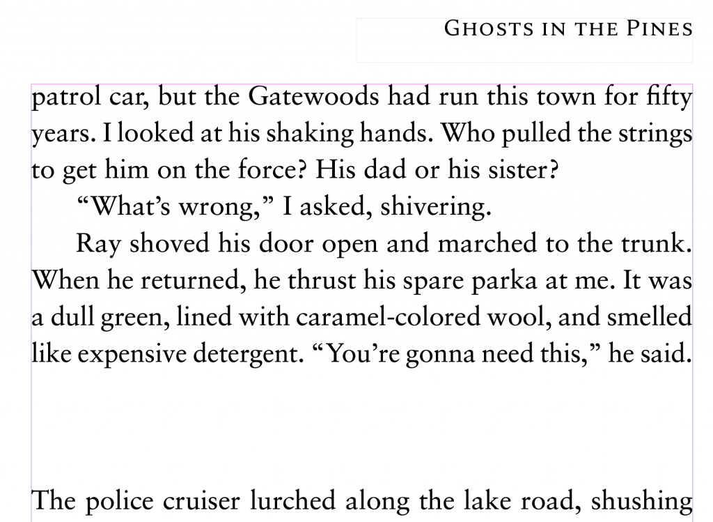
Here’s what the text looks like with Sabon (body) and Nocturne Serif (header).
Join the Search
I’m currently preparing for the September 2026 launch of GHOSTS IN THE PINES, a novel that prioritizes atmosphere and grit over spreadsheet metrics. If you’re tired of the same old mystery novel, join my inner circle for monthly dispatches on craft, noir, and the Inland Northwest.